Tucumcari Rebrand
PROJECT OVERVIEW
Client: City of Tucumcari, New Mexico
Industry: Municipal, Tourism
Services Provided: Identity, Branding, Print, Web, Social, Wayfinding
Collaborators: Robyne Beaubien Consulting, Connie Loveland, Anthropopulus
In Brief
We were tasked with developing a brand identity for the City of Tucumcari, New Mexico that would be used to build community pride as well as provide consistent external recognition for area travelers through marketing and tourism. The city boasts classic/retro Americana motels, tons of murals, and sees Route 66 tourism.
What We Did
Process.
Once information from city stakeholders and the New Mexico MainStreet Revitalization Specialist in Promotion were gathered, we met with the team to learn more about the residents, amenities, and future goals of Tucumcari and what they felt was important to market to travelers. From there, we developed a digital moodboard based on our previous discussions to spark conversation (and provide visual insight) on what looks and feels like Tucumcari.
Inspiration.
Through our discussions, we found that Tucumcari has a lot to offer as far as visual inspiration. Many of the amenities and perks of the city centered around five distinct cultural and historical pillars: classic neon motel signage, Indigenous American culture, “Wild West” American history, Route 66 & classic car subculture, and Hispanic culture & history. We found that these cultural pillars spoke not only to the interests and motivations of Tucumcari residents, but also would spark intrigue among travelers looking to experience the nostalgic charm of Route 66.
Solution.
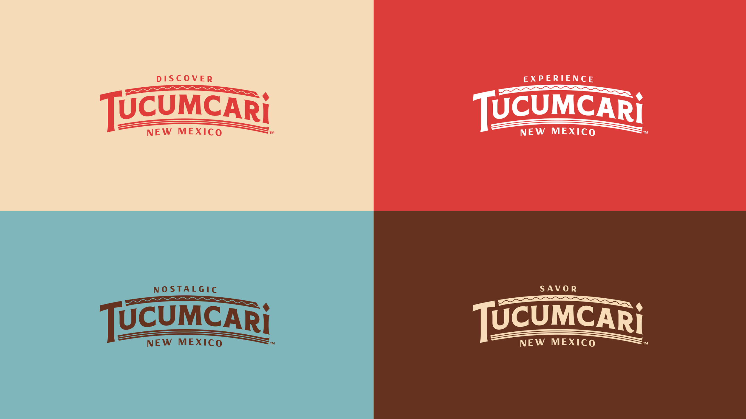
The final logo nods to every cultural pillar with subtle visual cues. This was done so that if a resident is interested in one (or more) pillar, it would resonate in a personal way, but a visitor with the same interests would also find intrigue, and the logo would in turn reflect some of the iconic experiences found when visiting Tucumcari.
Classic motel signage was reflected in the logo through the overall logo shape/curvature and the neon-like striping. Indigenous Americans (specifically Comanche) were represented through the diamond motif and striping as found in many native textiles and bead work. The type style and the logo profile, which also mimics the profile of Tucumcari Mountain, calls back to sign paintings and signage from the Old American West. Route 66 and classic car culture were also represented by the shape and layout of the mark, which also boasts a subtle resemblance to a classic automobile grille. Finally, the vibrant local Hispanic culture was represented through the brand’s color story, and the overall movement of the logo’s upper wave motif – which is found in traditional Hispanic dress and lace work.
Supporting Design.
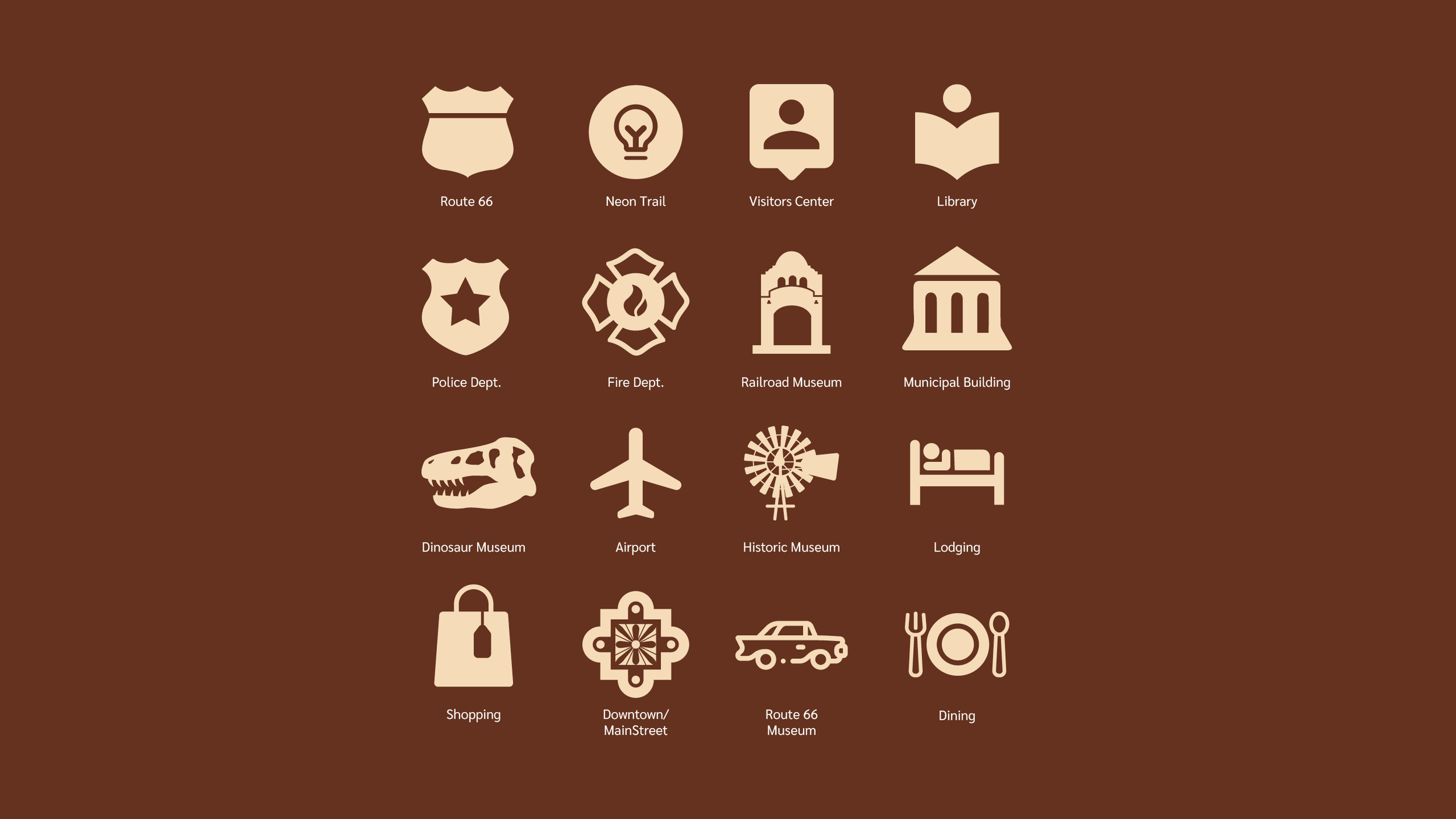
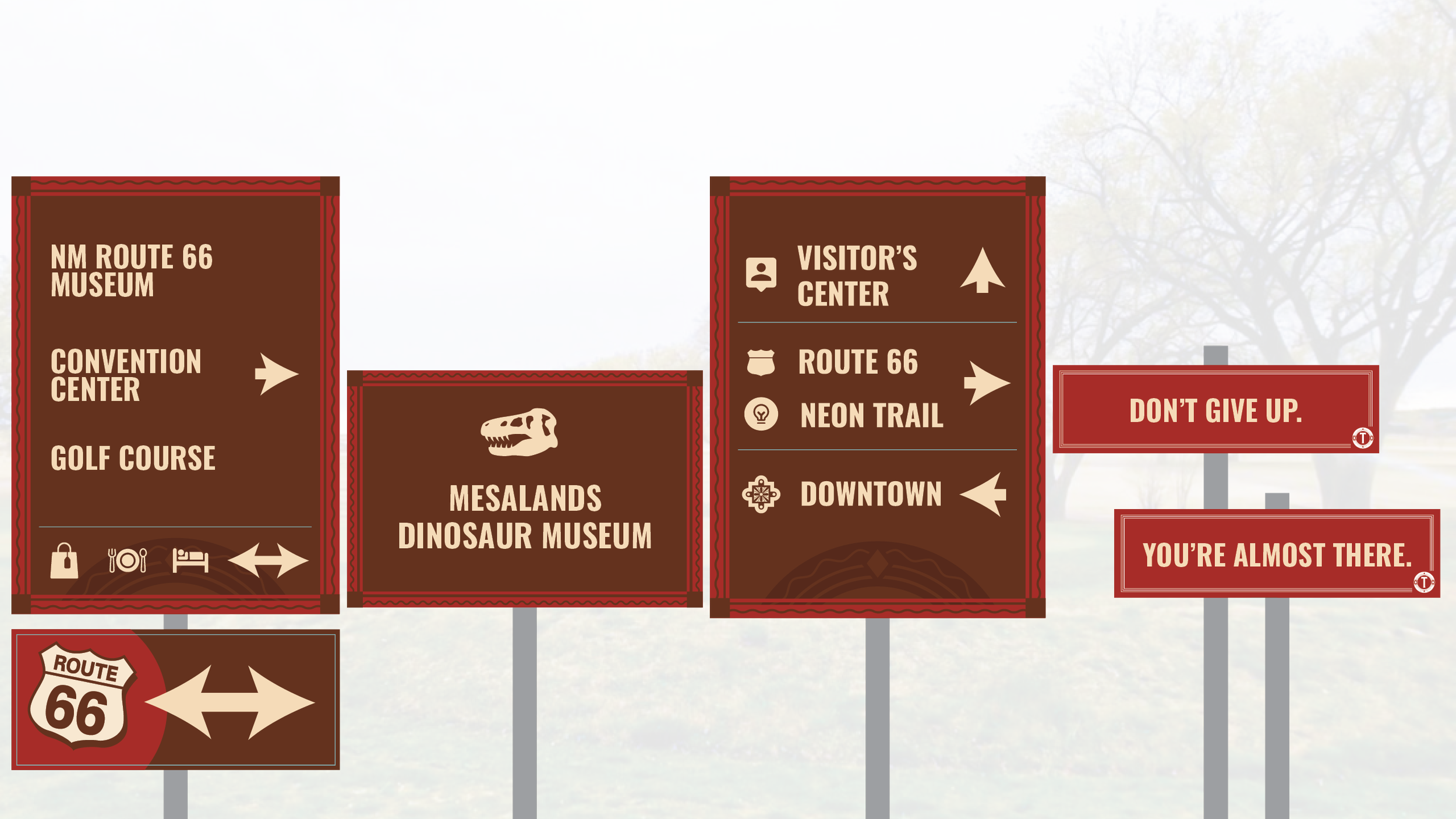
Once the final logo package and style guide was delivered (along with a revised city seal design), we stayed on board alongside the City of Tucumcari and Robyne Beaubien Consulting to help launch the new brand identity. During this process, we created billboard designs, rack cards, print ads, social media graphics, web ads, and swag. We also refreshed the city’s tourism website, with the most significant addition being an extensive mural directory. Our keystone supporting project with the City of Tucumcari was a printed Visitor’s Guide. The guide took on a secondary visual language, which — while utilizing the same color story of the City of Tucumcari identity — was inspired by field guides and map booklets from the glory days of the great American roadtrips. The guide highlights the history of Tucumcari, travel to-dos, day trips, events, and more. In partnership with Anthropopulus, we designed signage for a wayfinding system that pulls in elements from the city’s branding and Tucumcari MainStreet.


TL;DR
We designed a really beefy workhorse logo and visual branding system for a Route 66 New Mexican city that visually blends vintage motel signage, car culture, Native American motifs, and Latino tradition.

