City of Raton
PROJECT OVERVIEW
Client: City of Raton, New Mexico
Industry: Municipal, Tourism
Services Provided: Identity, Branding, Print, Social, Wayfinding Concepts
In Brief
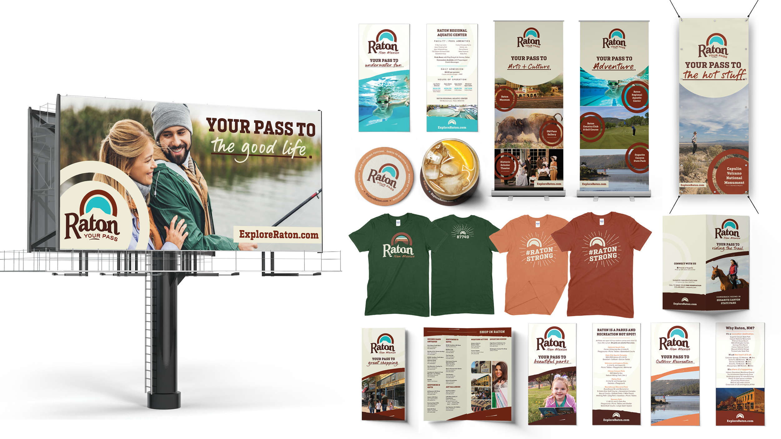
We were tasked with developing a brand identity for the City of Raton that would be used primarily for the tourism department. This new logo and brand identity would need to not only entice regional travelers in New Mexico, Colorado, and Texas, but also invigorate the local community with a heightened sense of pride and ownership. Our work extended beyond branding to include banners, t-shirts, billboards, large-format print materials, and wayfinding system concepts that supported the city’s broader initiative.
What We Did
Process.
Once information from city stakeholders and previous discovery sessions were gathered, we looked to several existing displays of the city’s name throughout the city’s landmarks. Though these displays may have been arguably historic and/or effective, considerations were made to hold the new logo to the general “spirit” of these styles and iconic/recognizable representations.
Inspiration.
Raton’s railroad system has long been a vital part of its history and continues to play a key role today. Amtrak travelers can experience the city’s offerings during lunch layovers on cross-country journeys or as part of day trips from nearby Colorado or Arizona. Knowing that the railroad culture is important to Ratonians and their visitors, we looked closely at typography and graphic elements used on old train tickets and passes from the late 1800s and early 1900s – particularly those in the Southwest region. Working through the logo iteration and sketch phases, reoccurring themes and iconography began to surface based on the history, goals, and culture of Raton.
Solution.
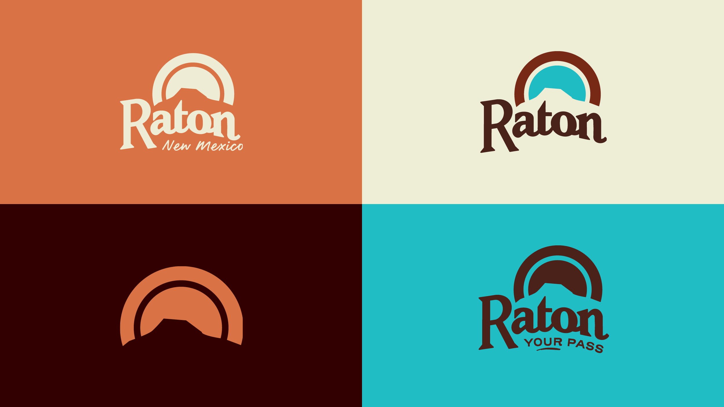
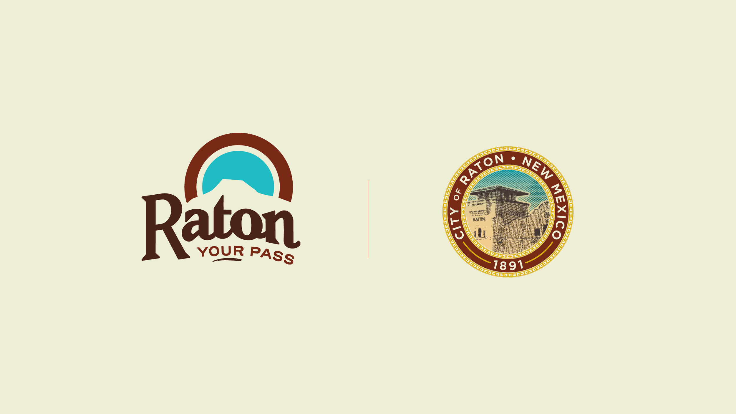
Logo. The final logo nods to Raton’s railroad history through its custom typography. It not only pays tribute to the iconic landmark of Goat Hill but, through the round motif, references travel, connectivity, and the enchanting New Mexican sunsets and people. A revised city seal based on the new logo and Raton Station was also delivered.
Tagline. “Your Pass” references the Raton Pass, a unique feature to the area and by which many visitors recognize the city. The use of “your” invites visitors to enjoy the community. The underline reflects a strike in the earth, hearkening to the mining history and also highlighting the duality of “your” and “our” in the same word. The use of the tagline was designed to be extended in marketing campaigns as “your pass to...”, allowing for flexibility in promoting area attractions and events.
Supporting Design.
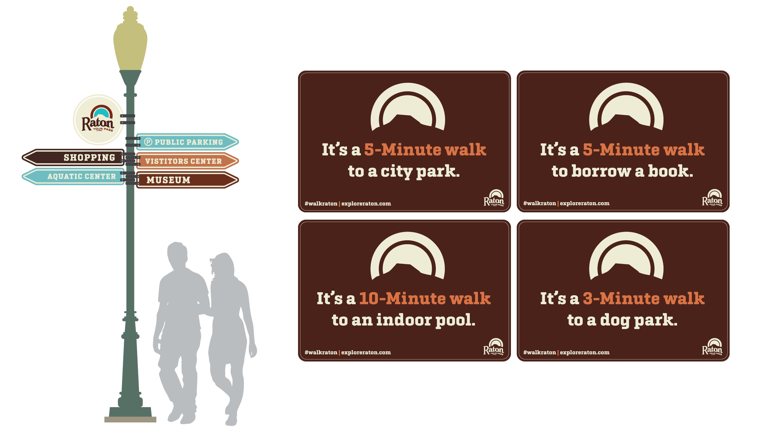
Alongside Raton’s brand rollout, we developed a range of supporting graphics and materials to bring the new visual identity to life. Rack cards were designed to highlight key local amenities, including the aquatic center, outdoor recreation, golf course, and parks. We also created billboards, banners, print and digital advertisements, postcards, t-shirts, and local shopping and dining guides. These materials established the foundation of the brand’s visual language, incorporating photography and the adaptable “fill in the blank” tagline to communicate why visitors should explore the city. Additionally, we presented wayfinding concepts at various cost and engagement levels, incorporating both new structures and existing infrastructure, which ultimately helped guide the city’s comprehensive wayfinding efforts.

TL;DR
We designed a logo (and a sweet “fill in the blank” tagline) that captures Raton’s history and character. Then, we brought the visual brand to life with marketing materials, local guides, and even wayfinding designs —because a great brand is no good if people can’t find their way to it.
